UI design brief — Perlin Studio¶
Audience: an AI design agent (e.g. Claude in a design-focused session) tasked with proposing a new look for the Perlin Studio web app. This file is the only context you need.
Format you should deliver: an updated index.html + styles.css
pair, plus a short rationale. No new build step, no new dependencies,
no JS rewiring.
1. What this tool is¶
Perlin Studio is a single-page browser tool that lets users generate parametric 3D/4D Perlin animations in real time, save PNG snapshots, and export seamless WebM loops. It is client-side only: no backend, no server calls, no telemetry. Users include hobby generative-art people, designers grabbing a background loop, and developers prototyping textures.
- Live demo: https://pages.jkaindl.de/perlin-studio/
- Repo: https://git.jkaindl.de/jkaindl/perlin-studio
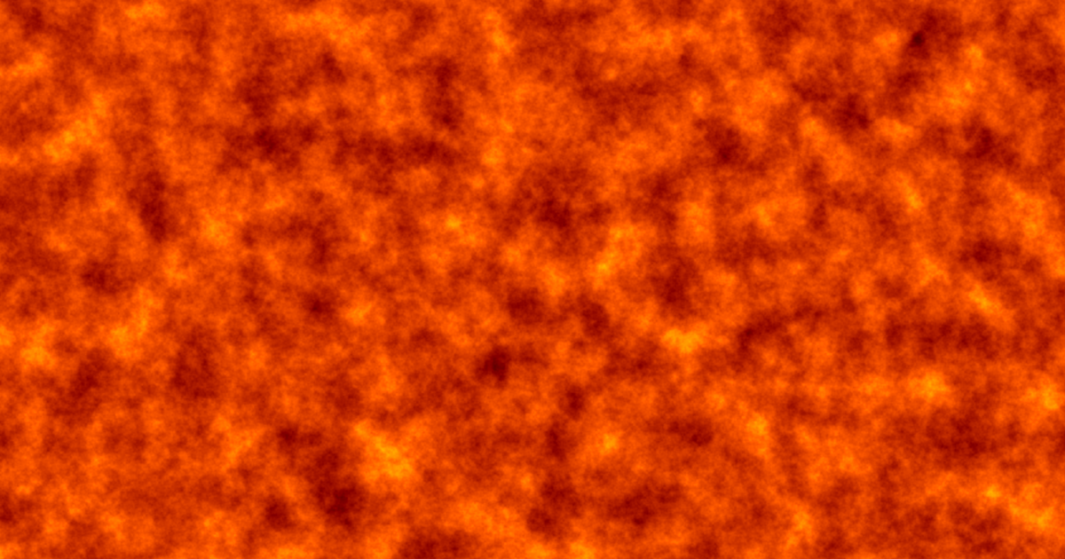
- Hero image (current render output):
assets/hero.png - Gallery (current render output):
assets/gallery-*.png - Full user guide (every control explained):
docs/reference/controls.md - Technical architecture (not relevant for design, but linked for completeness):
docs/explanation/architecture.md
2. Goal of this brief¶
Propose a modern, calm, generative-art-feeling UI that:
- Foregrounds the live canvas — the noise output is the hero.
- Keeps every parameter accessible without modal hide-and-seek.
- Feels great on mobile and on a wide desktop.
- Respects the project's existing identity (cyan/violet/green accent palette, soft dark default, AGPL hobby-project warmth).
Surprise me with the aesthetic direction within the constraints below — but the goal is "polished generative-art tool", not "minimalist landing page" or "enterprise dashboard".
3. Hard constraints (do not break)¶
These reflect the project's architectural guardrails (AGENTS.md).
Violating any of them = the design can't ship.
- Vanilla JS + vanilla CSS only. No React, Vue, Svelte, Lit,
Tailwind, PostCSS, Sass, or any build step.
<link
  rel="stylesheet" href="styles.css">
and two<script defer>tags is the entire pipeline. - No new dependencies. The current dep count is zero and stays zero. A self-hosted CSS-only icon font is OK if needed; an external CDN call is not.
- No JS changes. The JS controller (
perlin-studio.js) wires itself to specific DOM IDs. Those IDs are listed in §6 — every one must still exist with the sametype/name/role. You can re-arrange and re-style freely, but you can't drop, rename, or swap element semantics. file://must keep working. Double-clickingindex.htmlfrom Finder/Explorer must still launch the app. So: no service worker required for basic operation, no relative path that assumes a host.- Accessible by default. Keyboard navigable (Space already toggles play/pause via the JS layer — your design must keep that discoverable). Sufficient color contrast (WCAG AA at minimum) in both themes.
- English copy. All UI strings stay English; if you change wording, keep it terse and tonally neutral.
- License headers stay.
LICENSEis AGPL-3.0-or-later.
4. Soft constraints / preferences¶
- Light + dark theme via
prefers-color-scheme— system-driven, no manual toggle. Both themes ship. - Match the brand accent palette if possible (see §8). Substantial deviation is OK if you explain why.
- Don't optimise for "first impression / marketing wow" — this is a tool people use, not a homepage. Aesthetic restraint over decoration.
- Mobile must work, but the primary use case is desktop with a trackpad/mouse. Touch can be slightly second-class.
- Performance: the canvas already runs every frame in a worker. Don't add expensive CSS (giant box-shadow blurs, full-page filter effects, animated backgrounds behind the canvas). Frame budget is precious.
5. Current layout (today's structure)¶
┌────────────────────────────────────────────────────────────────────┐
│  HEADER: "Perlin Studio" + one-line subtitle                       │
├────────────────────────┬───────────────────────────────────────────┤
│  SIDEBAR (~320 px)     │  MAIN OUTPUT (flex)                       │
│                        │                                           │
│  Resolution            │  ┌─────────────────────────────────────┐  │
│    Width, Height       │  │                                     │  │
│                        │  │     Live preview canvas             │  │
│  Noise                 │  │     (square or 3:2, user-defined)   │  │
│    scale x, scale y,   │  │                                     │  │
│    Time scale,         │  │   (or <video> after recording)      │  │
│    base, octaves,      │  └─────────────────────────────────────┘  │
│    persistence,        │                                           │
│    lacunarity          │  ▶  ⏮   ━━●━━━━━ Loop progress = 0.42     │
│                        │                            fps 30  f 120  │
│  Loop                  │                                           │
│    ☑ Seamless loop     │  Status: Ready. Press ▶ or Space to anim. │
│    Duration, Radius    │  ────────── progress bar (recording) ──── │
│                        │                                           │
│  Color mode            │                                           │
│    Dropdown +          │                                           │
│    mode-specific       │                                           │
│    sub-controls        │                                           │
│                        │                                           │
│  Presets               │                                           │
│    [Save] [Load]       │                                           │
│    chips ×6            │                                           │
│                        │                                           │
│  Export                │                                           │
│    [PNG] [WebM]        │                                           │
│    [Download]          │                                           │
└────────────────────────┴───────────────────────────────────────────┘
│  FOOTER: small caption                                             │
└────────────────────────────────────────────────────────────────────┘

@media (max-width: 900px): sidebar collapses to a single stacked column.
The sidebar is always-on (no toggle), uses subtle uppercase
section headers (Resolution, Noise, Loop, …), and packs labels
+ inputs in a 2-column micro-grid. The main panel is a single canvas
with a horizontal transport bar below it.
6. Information architecture — every control¶
These IDs must exist in the final HTML. You can wrap, re-order,
re-style, and re-group freely, but each ID must reach the same DOM
node type with the same type attribute (where shown).
Resolution¶
| Label | id | Element | Range |
|---|---|---|---|
| Width | p-w |
<input type="number"> |
4–1024, default 256 |
| Height | p-h |
<input type="number"> |
4–1024, default 256 |
| Renderer | p-backend |
<select> |
cpu (worker, default) / gpu (WebGL2; disabled when unavailable). A viewer setting kept in localStorage, not part of presets or exports |
Noise¶
| Label | id | Element | Range |
|---|---|---|---|
| scale x | p-sx |
number | step 0.005, default 0.02 |
| scale y | p-sy |
number | step 0.005, default 0.02 |
| Time scale | p-st |
number | step 0.01, default 0.15 |
| base (seed) | p-base |
number | integer, any sign |
| octaves | p-oct |
number | 1–10, default 6 |
| persistence | p-pers |
number | step 0.05, default 0.5 |
| lacunarity | p-lac |
number | step 0.1, default 2.0 |
| Noise type | p-field-type |
select | perlin (default) / cells / borders / smooth |
| cell jitter | p-cell-jitter |
range | 0–1, default 1; shown (#cell-jitter-wrap) only when the noise type is not perlin |
Loop¶
| Label | id | Element | Notes |
|---|---|---|---|
| Seamless loop | p-loop |
<input type="checkbox"> |
default checked |
| Loop duration (sec) | p-loop-duration |
number, 0.5–60 | default 4 |
| Loop radius | p-loop-radius |
number, 0–4 | default 1.0 |
The duration/radius controls live inside a container with
id="loop-controls", which the JS hides when the checkbox is off.
Color mode¶
A single <select id="p-color-mode"> with options rgb, gradient,
hsv, posterize, cosine, flow. Each mode has its own sub-section
(<div class="color-section" data-for="rgb"> etc.) that the JS
shows/hides based on the dropdown. The data-for attribute is how
the JS finds them — don't change it.
- RGB sub-section — three range sliders (
p-rs,p-gs,p-bs, range 0–2 step 0.05) + three checkboxes (p-ri,p-gi,p-bi). - Gradient sub-section — a
<select id="p-gradient-preset">with optionsviridis|magma|fire|ocean|forest|grayscale|sunset|ice, plus<div id="p-gradient-preview">which the JS paints with the current gradient via inlinebackground: linear-gradient(...). - HSV sub-section — four range sliders 0–1:
p-hue-shift,p-hue-range,p-sat,p-val. - Posterize sub-section — one number input
p-poster-steps(2–16) + one selectp-poster-gradientwith the same 8 options as the Gradient one. - Cosine sub-section — a select
p-cos-preset(rainbow|dusk|rose|citrus|peach|neon|coral|custom), a preview stripp-cos-preview(painted like the gradient preview) and twelve number inputsp-cos-{a,b,c,d}-{0,1,2}(R, G, B). Editing a number sets the select tocustom. - Relief lighting (below the colour sub-sections, applies on top of any mode) — a checkbox
p-relief-onand#relief-controlswith seven range sliders:p-relief-gain,p-light-az,p-light-el,p-relief-amb,p-relief-spec,p-relief-shine,p-relief-eps.#relief-noteshows when the active colour mode ignores it (flow, RGB per channel).
Presets¶
<button id="btn-preset-save">Save</button>— saves current parameters as JSON download.<button id="btn-preset-load">Load</button>+ hidden<input type="file" id="preset-file">— opens file picker.- Six "chip" buttons with
class="preset-chip"anddata-presetattributes:default,lava,aurora,clouds,terrain,circuit. The JS readsdataset.preset.
Export¶
<button id="btn-png">PNG (current frame)</button>— instant download of the canvas as PNG.<button id="btn-webm" class="primary">WebM animation</button>— starts a frame-by-frame recording. While recording, this button is disabled and the progress bar shows progress.<button id="btn-webm-download" hidden disabled>Download WebM</button>— becomes visible after recording finishes.
Main output¶
<canvas id="canvas-output">— the live preview.<video id="anim-preview" controls loop>— replaces the canvas view once recording is done. (Both live inside<div id="canvas-wrap">.)
Transport bar¶
<button id="btn-play">▶</button>— toggles to ⏸ when playing.<button id="btn-reset-t">⏮</button>— resets the slider to 0.<input type="range" id="p-t">— scrub slider. Range is rewritten by the JS depending on loop mode:[0, 1]step 0.001 when loop is on,[-200, 2000]step 0.01 when off.- Two text spans:
<span id="t-label-name">shows "Loop progress" or "t" depending on mode;<span id="t-display">shows the numeric value. <input type="number" id="p-fps">(1–60, default 30).<input type="number" id="p-frames">(1–600, default 120).
Status row¶
<div id="status">— status text (errors get classerror).<div id="fps-counter">— live FPS readout during play.<div id="progress">with inner<div id="progress-bar">— width is set via inline style for the recording progress bar. JS toggles theactiveclass on the outer div.
7. Interaction patterns¶
- Every numeric input + range triggers a debounced live re-render (the JS handles the debounce, you don't have to).
- Color-mode dropdown instantly swaps which sub-section is
visible (
hiddenattribute is set/cleared on the sub-divs). - Preset chip click loads its parameter set, resets
tto 0, re-renders. Status bar saysPreset "<name>" loaded. - Save button triggers a file download.
- Load button opens a file picker, on file select loads the JSON and applies it.
- Space anywhere outside an input triggers play/pause.
- Recording flow:
- User clicks "WebM animation"
- Buttons disable, progress bar appears
- Status updates per frame:
Recording: frame 5/120 (loop) - When done, the canvas hides (
.hiddenclass), the<video>appears (.readyclass added), and the download button becomes visible.
The classes hidden, ready, active, error, primary are
used by the JS — keep them as styling hooks.
8. Current design system (for reference, not a constraint)¶
Today's styles.css uses CSS variables:
| Variable | Dark default | Light theme |
|---|---|---|
--bg |
#1a1d21 |
#f4f5f7 |
--panel |
#24292f |
#ffffff |
--panel-2 |
#2d343c |
#eef0f3 |
--text |
#e6e6e6 |
#1a1d21 |
--text-dim |
#9aa3ad |
#5a636c |
--accent |
#6aaa40 |
(same) |
--accent-2 |
#4f8a30 |
(same) |
--danger |
#d9534f |
(same) |
--border |
#3a4048 |
#d6dae0 |
--radius |
10px |
(same) |
--gap |
14px |
(same) |
The brand accent palette (also used in the SVG favicon and badges) leans toward generative-art tooling:
| Hex | Role | Used in |
|---|---|---|
#16e0e0 |
cyan | favicon highlight, "Launch web app" badge, "no dependencies" badge |
#8a4dff |
violet | favicon body, AGPL badge |
#39ff7a |
green | favicon highlight, "no build" badge, hero CTA |
#0a0a18 |
near-black | favicon base, theme-color dark |
If you reuse this palette, the design will feel unified with the favicon, the PWA install icon, the README badges, and the OG card. You may also propose an alternative palette — please show how it relates to the existing brand assets.
The current font stack is the system stack:
-apple-system, BlinkMacSystemFont, "Segoe UI", Roboto, sans-serif,
plus a monospace stack for code chips. Web fonts are allowed only if
they don't require an external CDN call (i.e. only self-hosted) and
add no perceptible weight.
9. Responsive requirements¶
- Desktop ≥ 1100 px: two-column layout (sidebar + canvas area) as today. Canvas should be able to grow to fill available width while preserving the user-chosen aspect ratio.
- Tablet 700–1100 px: sidebar + canvas remains, but the sidebar
can compress (smaller padding, tighter rows). Some sections could
collapse to
<details>if it helps. - Mobile < 700 px: single column. The canvas comes first, the sidebar stacks underneath. The transport bar stays right after the canvas. No horizontal scroll.
The current breakpoint is max-width: 900px. Adjust as needed.
10. What's specifically up for redesign¶
I'd love a fresh take on:
- Section grouping in the sidebar. Today it's six flat sections (Resolution / Noise / Loop / Color mode / Presets / Export). Some could benefit from progressive disclosure or smarter grouping.
- The transport bar. Today it's a wide flex row that gets cramped on mobile. Could it become a vertical strip beside the canvas on desktop, or a sticky bottom bar?
- The preset chips. Today they're plain text buttons. What about miniature swatches/gradient previews on each chip?
- The gradient preview. Currently a simple horizontal bar — could be more informative.
- Status + FPS readout. Today both live in a separate row under the canvas. Could they be subtler?
I'm explicitly not asking for:
- New features
- Renaming or restructuring presets
- Changes to the math glossary
- A logo redesign (assets/favicon.svg stays)
- Adding any user accounts, social sharing, or analytics
11. Deliverables I'd love back¶
- The updated
index.html(full file, drop-in replacement). - The updated
styles.css(full file, drop-in replacement). - A short rationale: ~10 bullets explaining the major design
decisions (e.g. "moved transport bar to right side because…",
"grouped sub-sections under
<details>because…"). - If you propose two directions: a quick A/B description so I can pick one before you commit to a full implementation.
If you spot something in this brief that's ambiguous or contradictory, please flag it before designing rather than guessing.
12. Verification checklist before handing back¶
- [ ]
node --check perlin.js && node --check perlin-studio.jsstill passes (you shouldn't touch JS, but verify anyway). - [ ] Every element ID from §6 is present in
index.html. - [ ] The 5 JS-managed classes (
hidden,ready,active,error,primary) are styled. - [ ] Dark + light theme both look intentional, tested by toggling
prefers-color-schemein browser devtools. - [ ] Mobile (375 × 667) layout has no horizontal scroll.
- [ ] Double-clicking
index.html(no server) renders correctly.
Thanks. Have fun with it.